 belize
belize
belize
Every color, font, and form tells a story of Belize — its people, its nature, its ambition, and its place in the world.
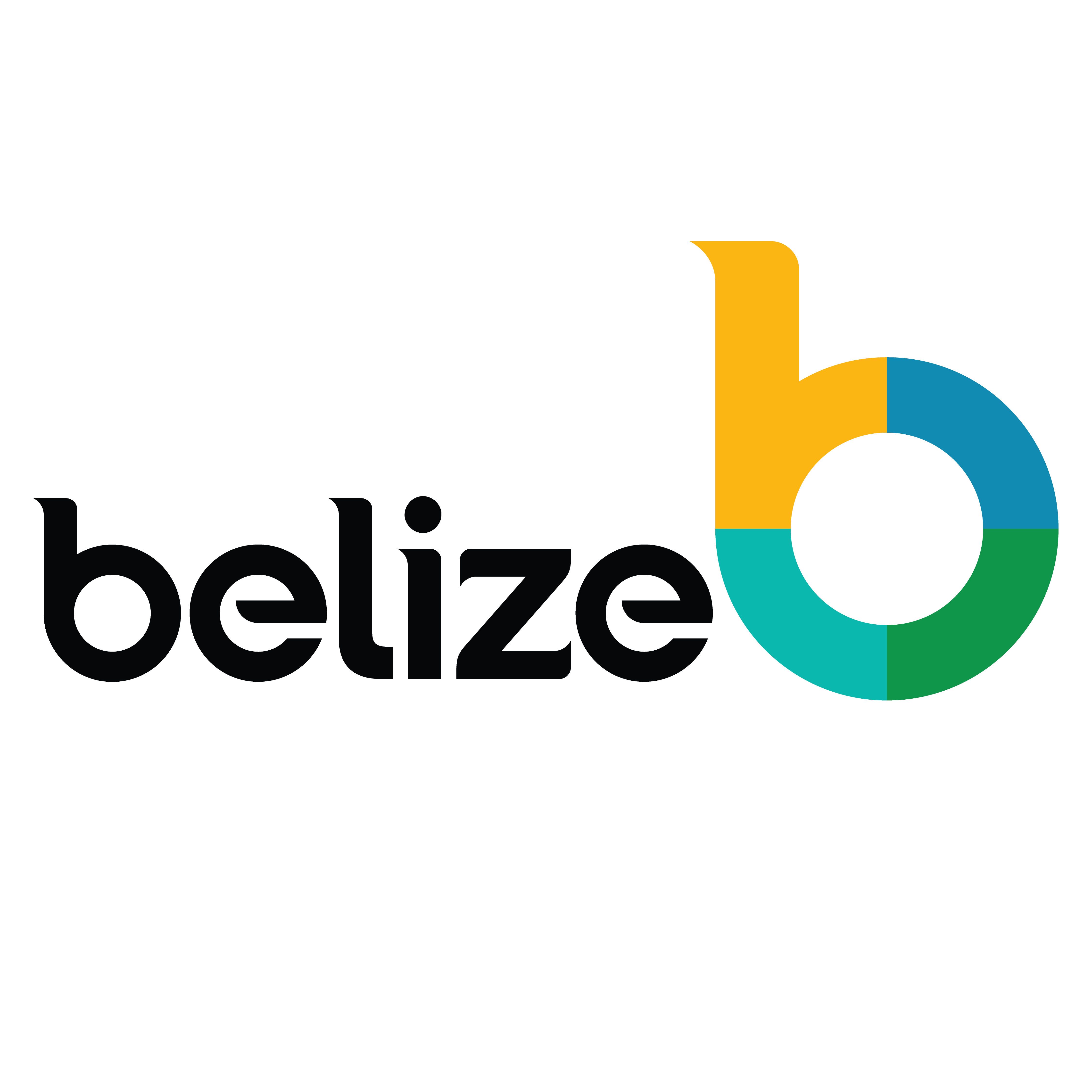
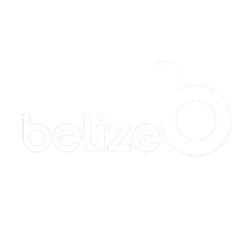
A single letterform that carries the full weight of a nation's identity.

A stylized lowercase "b" — the first letter of Belize — designed with geometric precision. Bold, legible, and uniquely ownable at any scale from billboard to business card.
A central circle cutout within the "b" acts as a graphic window — a frame through which the world sees Belize. Photography, landscapes, and cultural imagery may be placed inside it.
The symbol is divided into four colored quadrants — each mapped to a brand color and a national pillar. Together they express Belize's diversity and the four dimensions of the national brand.
The lowercase "belize" wordmark accompanies the isotype using the MADE TOMMY typeface. It appears in Charcoal on light backgrounds and in White on dark or color backgrounds.
Four primary colors derived from the isotype, plus an extended palette for digital and print applications.
A type system that balances authority with warmth, built for legibility and brand character at every scale.

Nunito is the approved web substitute for MADE TOMMY. Use MADE TOMMY for print, signage, and official documents; Nunito for all digital and web applications.

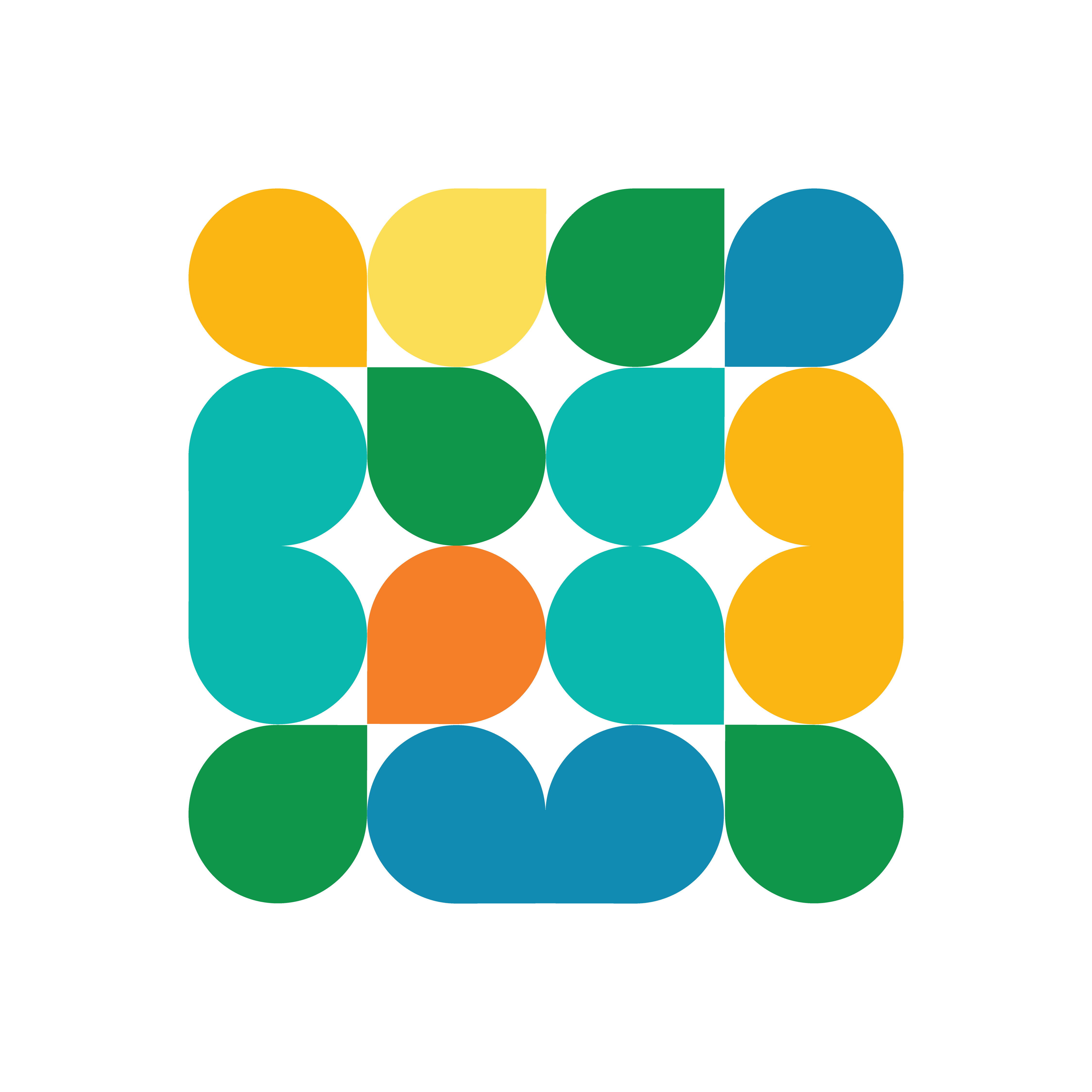
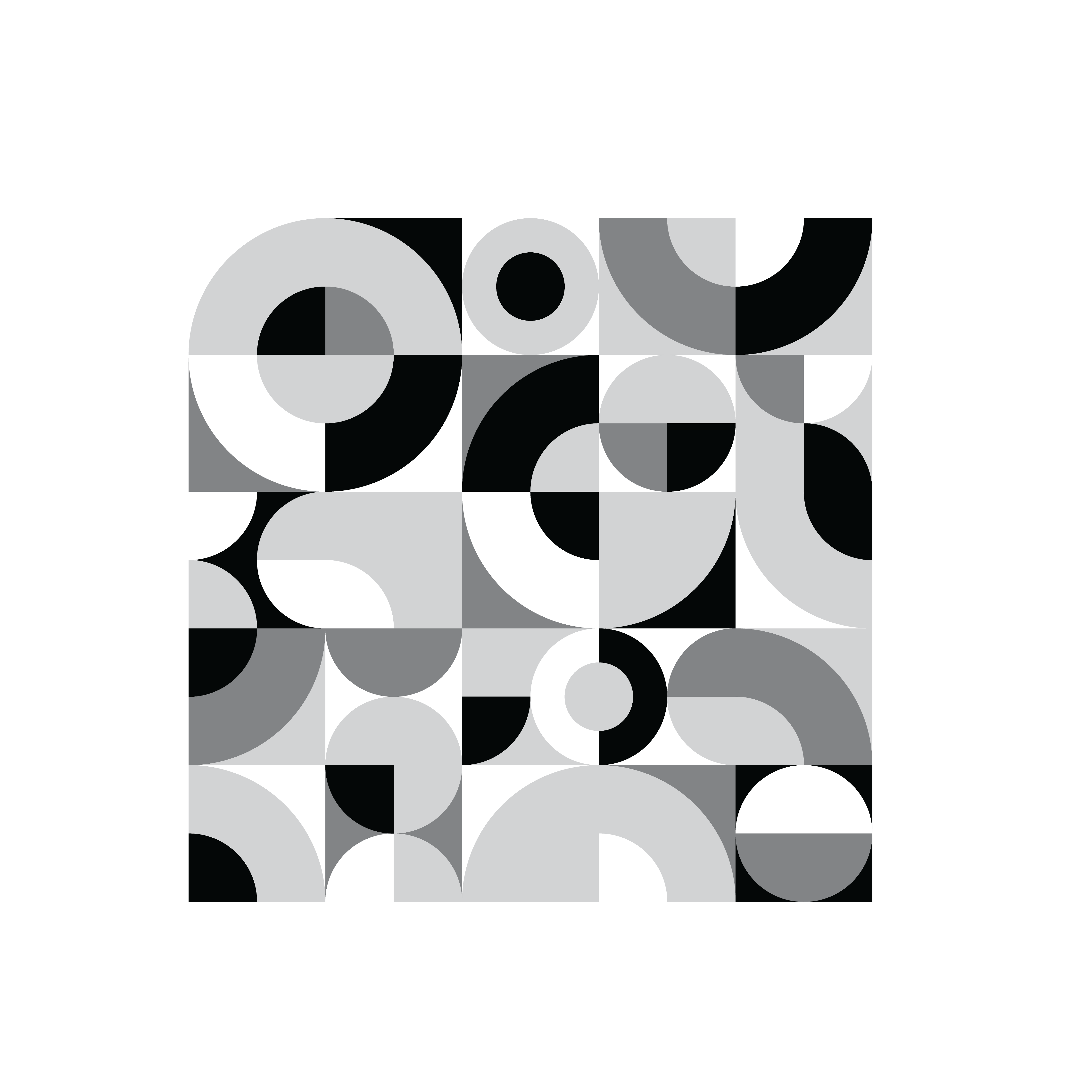
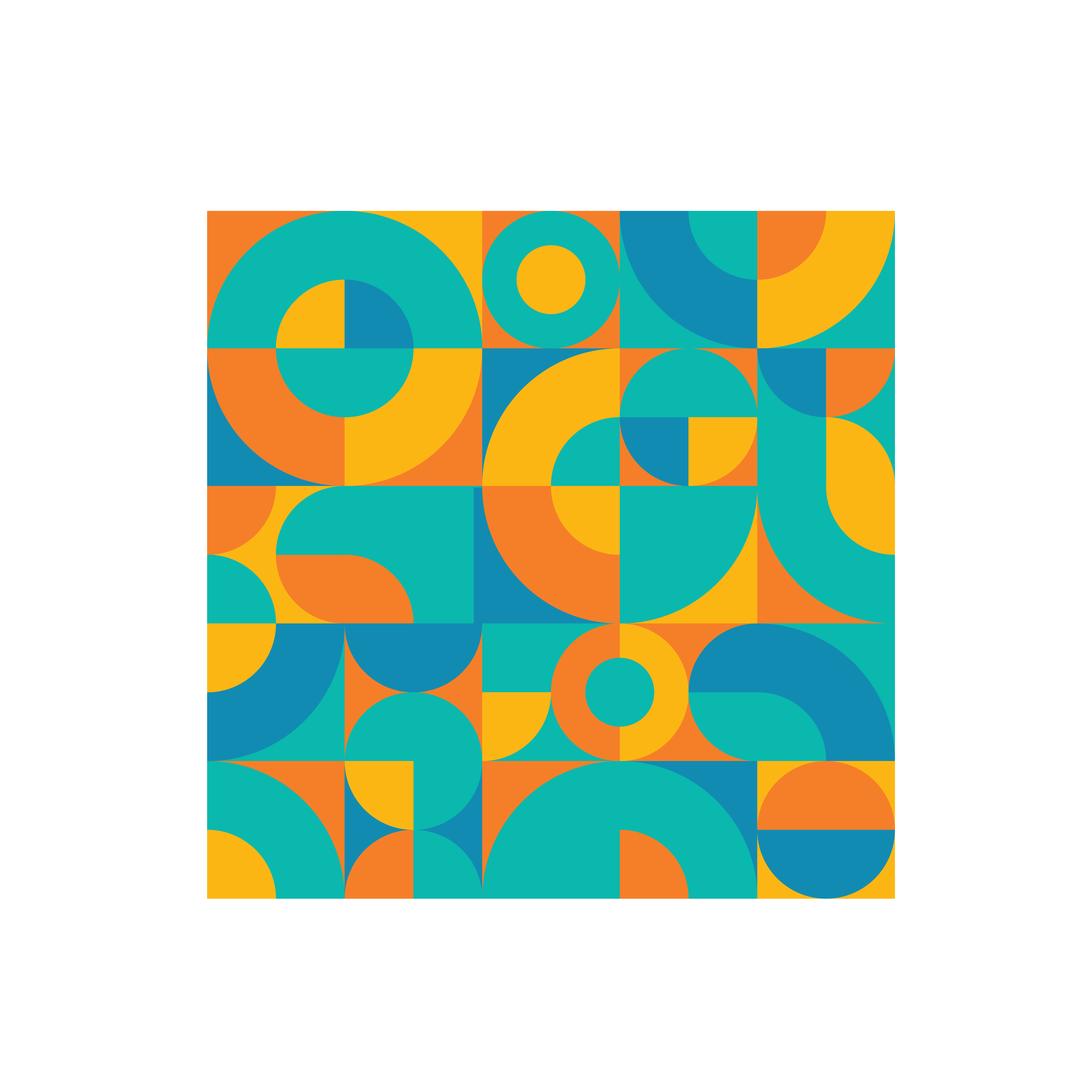
The Belize Brand's graphic language is derived from the "b" isotype itself. By isolating and repeating the quarter-circle and petal shapes found within the letterform, a rich and flexible pattern system emerges.
These patterns serve as full-bleed backgrounds, decorative borders, section dividers, and surface treatments across print and digital applications. They can be used in single-color or multi-color configurations, at any scale.
Quarter-circle shapes extracted from the "b" letterform's counter and stem geometry
Full-bleed BG, watermark, border accent, section divider, surface treatment
Single-color tonal, multi-color brand palette, monochromatic, reversed on dark
Scalable from small repeated tile to full-page hero treatment without quality loss

The Belize brand mark has two primary versions — Positive for light environments and Negative for dark or color backgrounds.

Full-color symbol with Charcoal wordmark. Use on white and light-colored backgrounds only. This is the primary version for most applications including print materials, web, and packaging.
White symbol and white wordmark. Use exclusively on dark backgrounds, solid brand color surfaces, and full-bleed photography. Ensures maximum legibility and contrast in any dark context.
Use positive logo on white or light backgrounds
Use negative logo on dark or solid-color backgrounds
Always maintain minimum clear space around the logo
Never distort, stretch, or resize asymmetrically
Never apply gradients, shadows, or filters to the logo
Never rotate, tilt, or use colors outside the palette
Every image chosen for the Belize Brand should feel authentic, vibrant, and forward-looking — reflecting real people, real places, and real opportunities.
Belizean people, authentic expressions, cultural moments. Focus on faces, hands, human connection — celebrating the diversity of Belizean communities.
Lush landscapes, produce at harvest, sustainable farming, marine ecosystems. Vivid colors that reflect Belize's extraordinary natural endowment.
Cargo operations, business districts, modern infrastructure, international commerce. Projects confidence and capability to global trading partners.
Garifuna Settlement Day, Belize City Carnival, traditional dance, music festivals. Joyful, vibrant, energetic imagery that embodies the Belizean spirit.
Ancient Mayan temples, colonial architecture, modern Belmopan, vibrant Belize City streetscapes. A layered sense of place and history.
Caribbean coast, barrier reef, cayes, fishing communities, clear turquoise waters. Captures Belize's world-class marine environment with clean, luminous light.